It is a commentary video up to the milestone report
Examination of composition
When creating a dashboard, it is better to consider the purpose, etc., and consider what kind of information to prepare and arrange in advance.
For whom and for what
First, consider who, what, and what information the dashboard is based on.
- Is it a dashboard for teams, middle management, or executives?
- data.What is the most useful data or information for the subject?
- Is the dashboard for a single project, multiple projects, or a general information portal?
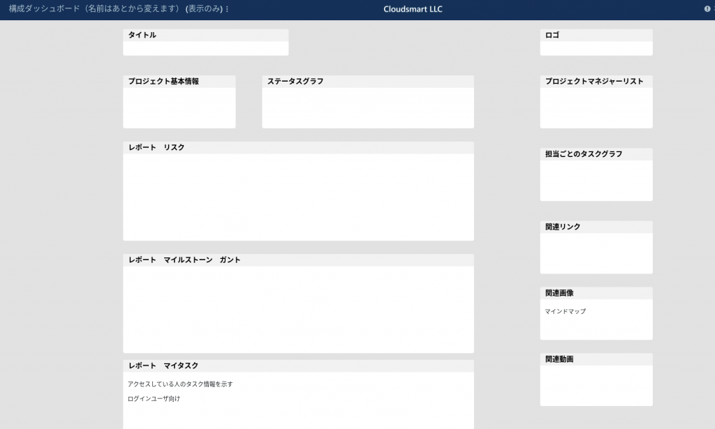
Configuration dashboard
Once you have an idea of the purpose and what kind of information to put in, it is one way to make a rough composition.Rich text widgets are a good choice. → This is recommended as a Smartsheet best practice, but I haven't prepared it so carefully.
Material preparation
The dashboard itself cannot do any calculations.Calculations must be done within the sheet using a summary section that contains hierarchical functions and sheet-level formulas.
Next, set up the report.The report gets the data from the sheet and the dashboard gets the data from the report, so try to collect only the data you want to see.
- Data in the sheet
- Sheet data: Aggregate totals and averages from sheet data.For the data you want to include in the dashboard, you must first calculate on the sheet and then display the results.
- レポート
- You can import Smartsheet reports into your dashboard.When you create a report, you can view a specific set of rows and columns and combine information from multiple sheets into a single view.
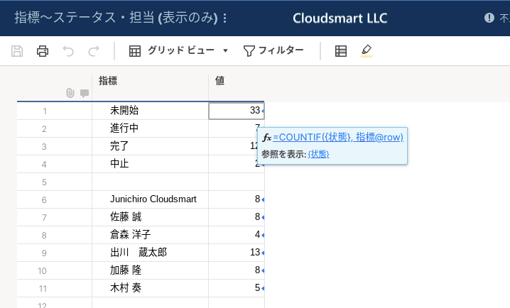
Creating a metric sheet
Make a sheet for metrics (index) and start from the original sheetCrosssheet functionData is aggregated using.
In many cases, the original data of the graph is also created on the index sheet.
In the example of the index sheet below, the COUNTIF () function that refers to the status column {status} of the original project management sheet aggregates the number of tasks for each status.
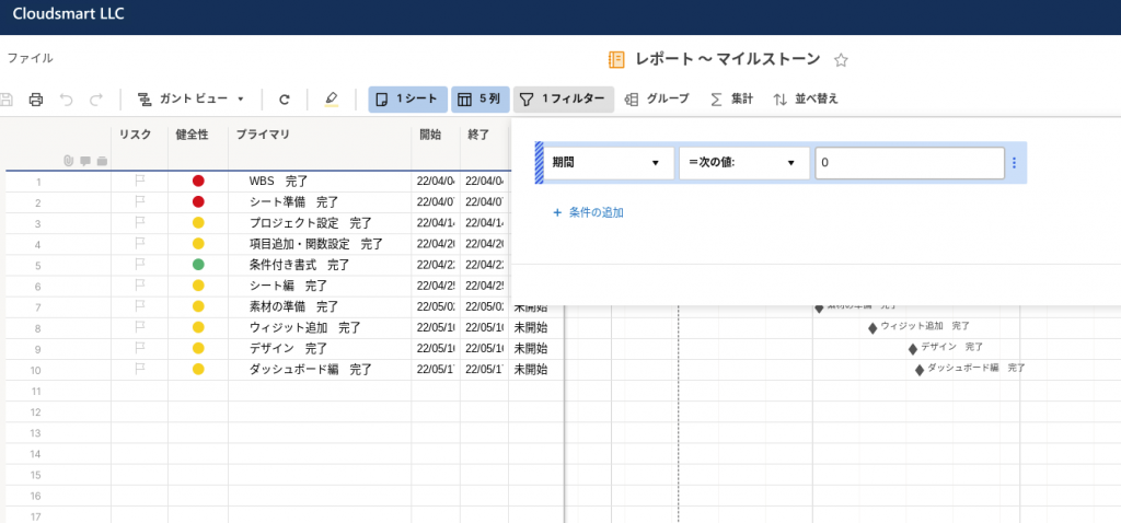
Creating a milestone report
In the case of the milestone report, we are filtering only the milestone rows from the original project sheet, taking advantage of the fact that the milestone period is XNUMX, as shown below.
Copy of report (Tips)
Hint: Hint:The following report can be created by simply saving and copying the previous report and changing the columns and filters.It is efficient to copy and create reports that refer to the same sheet in this way.
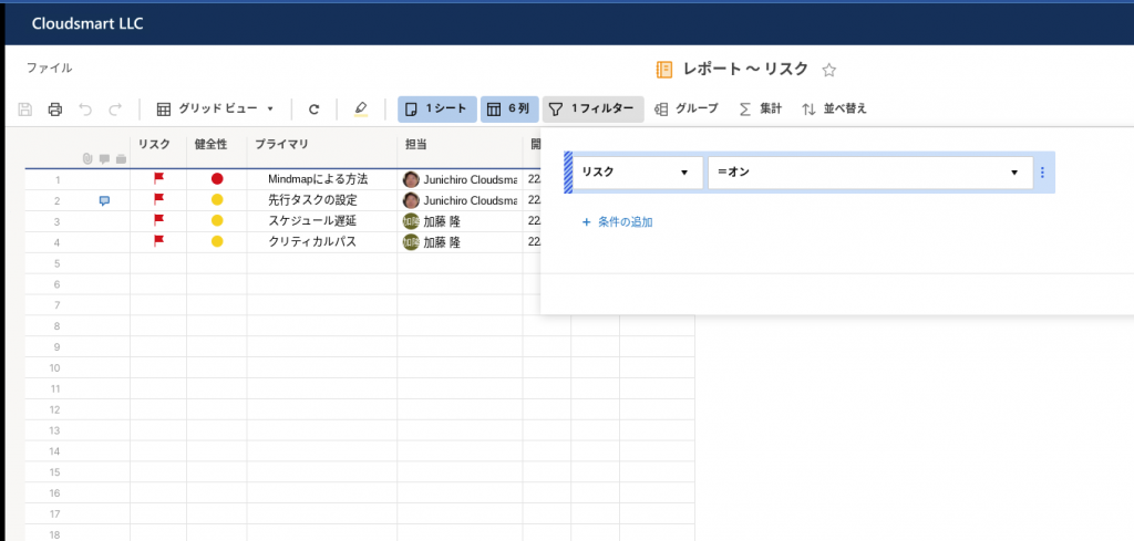
Creating a risk report
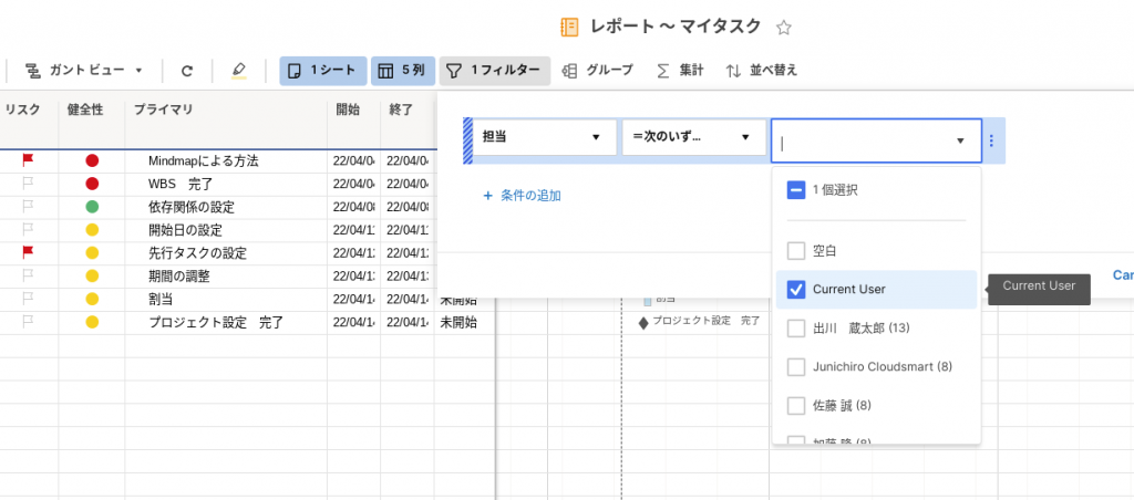
My task report
Filter by Current User (Tips)
Hint: Hint:My task report is in charge with a filter Current UserIf you specify, the rows of the same contact (assignment column, contact column) as the contact of the person who is logged in and viewing the report will be filtered.
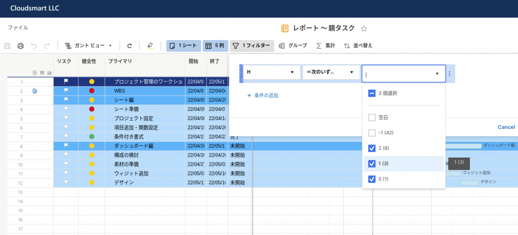
Report of aggregate task (parent task)
The "Report-Parent Task" below is the parent row (parent) of the task by the column H (not shown in the image below, click to see in the published report) showing the level of the parent row. It was created by narrowing down the tasks (tasks, aggregation tasks) with a filter.
It's functionally the same as the milestone report above, but it may be beneficial to be able to create it if the task is structured with indentation, even if there are no milestones.
It is an explanation video up to the report of the aggregation task (parent task)
Add widget
Now that the material is ready, we will place the content on the dashboard with a widget (referring to the configuration dashboard). (In addition, in order to check how it looks on the dashboard, it may be common to actually make the material and paste the widget.)
XNUMX types of widgets
I think that understanding of widgets will be deepened if they are organized into three types as follows.
- Widget to concatenate sheet and report data
- Metrics, graphs, reports
- Widget to format dashboard with text and image
- Title, rich text, image
- Widgets that capture external content
- Shortcuts, web content
First, link the data from the sheet and report.
Hint: Hint:It's a good idea not to stick to "cleaning" your dashboard from the beginning.I think it's a good idea to connect the data to the widget first and then focus on the design side.
Metrics
Metrics are used to display data in any cell of the sheet.
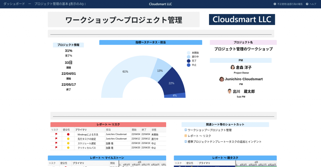
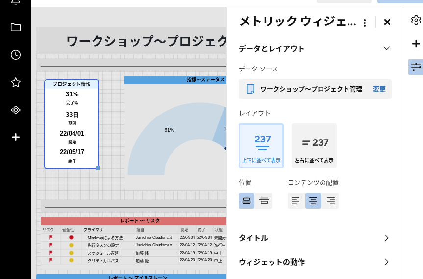
Project information metrics
This metric shows information about the project that is aggregated in the top parent row of the original project management sheet. (In the data source, the relevant cell in the top parent row is selected.)
Hint: Hint:It is efficient to select a series of cells at once and delete unnecessary ones.
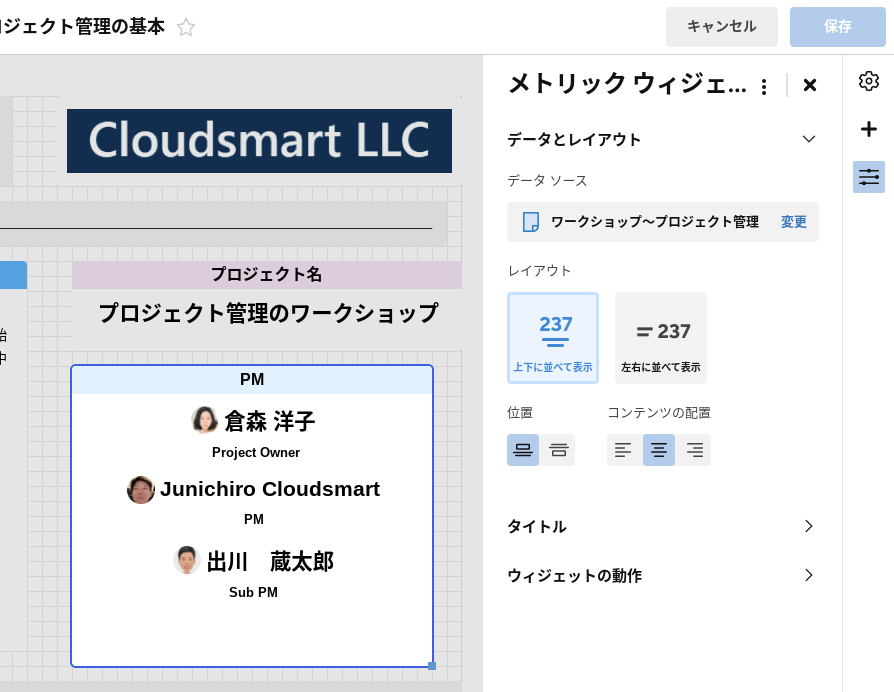
Member information metrics
The PM metrics below are for the project manager.Make another sheet,Sheet summaryYou can also use or create a summary row, but here we're just selecting and displaying that cell in the person's column.
Graph
We will create a graph based on the data in the metrics sheet created above.
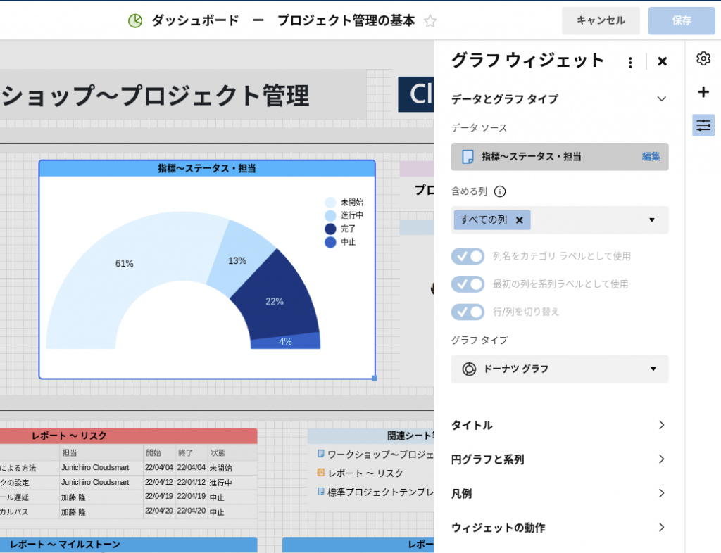
Status graph
The status graph is set as follows.
- Data source: Indicator-status / corresponding cell in charge
- Graph type: Donut graph
- It is a semicircle
- Instead of the default color, the darkness is changed with the same color system
- Articles on best practices on how to use colorsplease use this form.
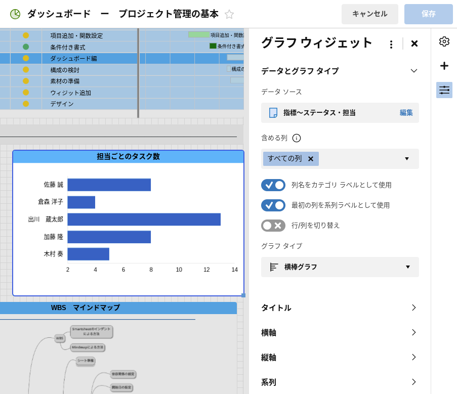
Graph of the number of tasks for each person in charge
Similar to the status graph, a bar graph is created based on the corresponding cell of the index-status / charge sheet.
レポート
We will place the report created as the material above on the dashboard using the widget.
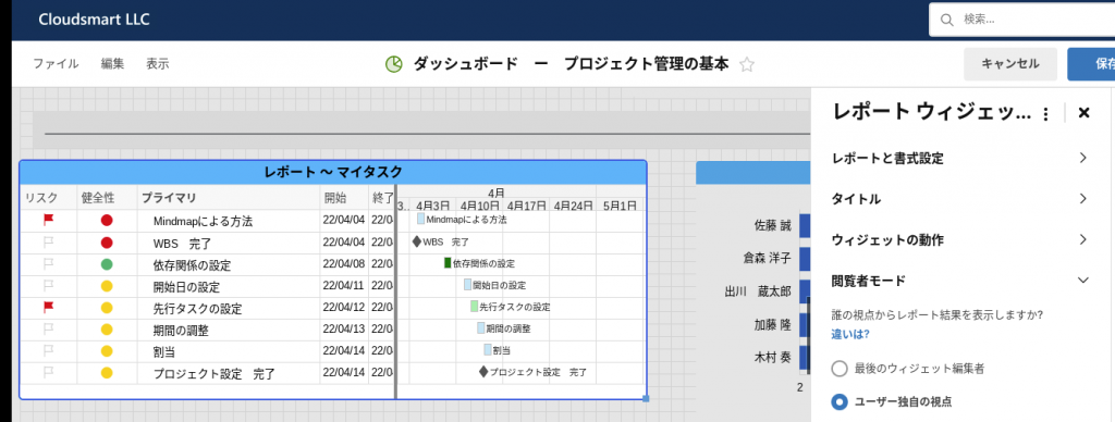
Set My Task Report to User's Own Perspective
As described in the My Tasks Report for Creating Material above, filter the contacts of the logged-in user to see the tasks of that logged-in person.
In the image below, on the right menuViewer modeTheUser's unique perspectiveSet to.
Please note that this is premised on sharing the dashboard that the person viewing the dashboard logs in to view, and this function cannot be used with public dashboards.
This is a video explaining widgets such as metrics and graphs. (Up to the viewer mode of the report widget)
Shortcut (link)
It is very efficient to use the dashboard as an information hub and link all the relevant documents about the project.Links give you direct access to important Smartsheet sheets, external web pages, files, and more.
Widget behavior
When you click on the content created by the widget, you can select the following actions.
- do nothing
- Open the data source
- Open another site
- Open a Smartsheet item
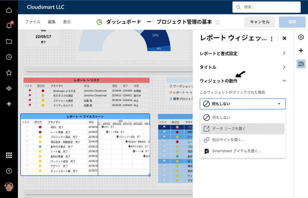
This is selected by considering what kind of information should be given to the dashboard user.
"Opening a data source" is the easiest, but it doesn't make sense if you get the same information you see on your dashboard.
For example, in a dashboard that manages multiple projects, the number of projects at risk is, for example, "Be careful! 2When indicated by the metrics, this "Be careful! 2You can provide in-depth details by allowing you to open the dashboard of a project that needs attention when you click.Drill downWill be possible.
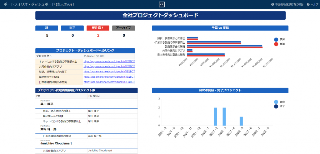
Of the image aboveBe careful!XNUMX ofClick to open the dashboard below, where you can see what the project needs attention.
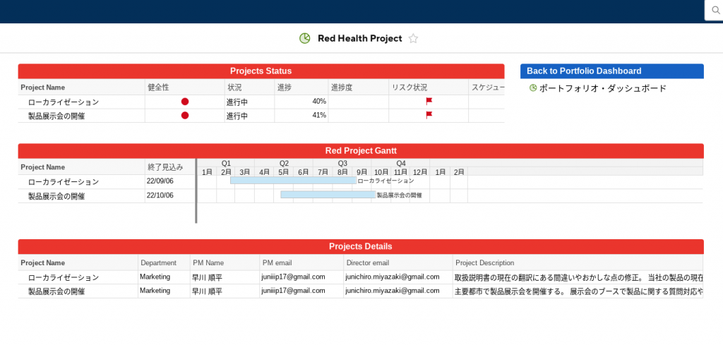
The author was in December 2021Smartsheet Professional Services CertificationWhen I took the exam, one of the thirty-odd scoring points was a navigation item, and there was a requirement that "you can drill down as needed and find related information easily". was.The above Red Health Project is good, but it is meaningless to set the data source to be displayed indiscriminately in other widgets, and it is deducted, and there is also a goal due to omission of sharing setting to PM of Control Center.96 points.
Hint: Hint:Especially if the person looking at the dashboard is an executive,Ingenuity to easily reach meaningful informationI think it's a good idea to drill down, for example, to open related reports and dashboards.
Design
Take advantage of titles, rich text, and image widgets to set your design, paying attention to the overall placement.
- title
- Use the title widget to place it in the center of the top, for example.
- logo
- Use the image widget, for example, to place it on the top right side.
- Configuration
- Place important information such as project status and key performance indicators (KPI) at the top, and more detailed information at the bottom.
- Separator
- Hint: Hint:Use image widgets and title widgets to place dividers for each chunk of information to make the dashboard easier to see.
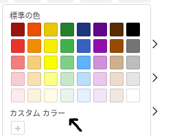
- Color coordination
- Instead of using the default settings, you can make the entire dashboard a common color theme, from titles to charts.
Share dashboards with stakeholders
Once you've built your dashboard and displayed all the data you need, set up sharing.There are two levels of dashboard sharing. "Viewer" and "Administrator".
Sharing at the viewer level
Viewers can view all content on the dashboard, but cannot edit or share it with others.
Dashboard report features
Unlike regular reports,Viewers can see the report displayed on the dashboard without having access to the underlying sheet to view the information on the dashboard..
Normally, sharing a report requires sharing a sheet, but dashboards don't need to share a base sheet like this, soInstead of showing the entire sheet, you can narrow down the report to the information you need and need to show it to your dashboard viewers.
Sharing at the administrator level
Any administrator can add, remove, and edit widget and dashboard layouts.
It is an explanation video of the part after the shortcut widget
Summary
Dashboards can create homepage-like portals for executives and team members without specialized knowledge.
Of course, knowledge of the underlying sheets and reports is required, but with some ingenuity, it can be used as a powerful tool for sharing information in an organization.
The customers I have worked with are using dashboards in a variety of areas, including:
- Set up links to various information needed by team members
- View new orders in real time
- Documents and videos provide guidance necessary for using Smartsheet
- Real-time display of new projects for sales members nationwide
- The shortest refresh cycle is 1 minute.
- Used as a start screen for regular meetings of executives
Of SmartsheetDashboardYou can access the experience corner to have the image of.